Search This Blog

Saturday, February 27, 2010

Who is Steering the Ship: Consumer or Designer?

(Post originally appeared on Hill Holliday Blog)

A recent blog article addresses whether the designer or consumer has greater influence over the behavioral patterns of the other. There is no doubt the corporate design approach is getting more people-centric, with a stronger emotional appeal. To answer the question asked at the end of the article about where the trends starts (whether it starts with the designer playing off the consumer behavior, or whether the designer shapes the idea of the consumer) I would have to say it is a complicated question. If this question were asked twenty years ago, the answer would be that designers shape consumer behavior and experiences. Now, I would say that designers react to the consumer’s patterns, behaviors, and emotions. Consumers engage with content in an entirely different way than they did even a decade ago – social networks including Facebook, Myspace, Twitter, YouTube are completely driven by the engaged user. People have the ability to post their reactions and emotions towards their environment and the content they engage with in real-time. Designers in this day of age react to the influence of this social and real-time mentality.

One recent example of design following the behavior and preferences of the consumer/user is a halfpipe in a freestyle park. Recently, I went skiing and some of the free-style equipment was tagged with graffiti, but on closer examination, I realized it was designed to look like it had been defaced. In this example the halfpipe’s designer played off of the rebellious nature of snowboarder or freestyle skier.

This article reminded me of a previous Forrester report on Emotional Experience Design. Forester proposes the idea that functionality can’t always solve corporate problems, but companies really need to get to the heart of the consumer’s goals, while developing a specific personality. The key to solving the consumer conundrum is appealing to the consumer on an emotional level.


Storytelling: Gone or Just Transformed?

(Post originally appeared on Hill Holliday Blog)

In a November blog post, Ben Macintyre questions whether the Internet is killing storytelling. “The information we consume online comes ever faster, punchier and more fleetingly”. Our attention span has plummeted, and as a result, the narratives have been sacrificed for more condensed snippets of information.

We definitely have an attention deficit when it comes to online consumption, but it may not be necessarily negative, but rather a reflection of the way the world is evolving – for better or for worse. As technology has expanded (iPods, smart phones, the Wii, just to name a few), we have an increased amount of distractors that compete with our attention. For example, as you type the URL to the Apple website to finish your Christmas shopping, you see an email alert overlay in the bottom of your screen, then an IM pops up from your co-worker, and now your phone beeps with a new text, all while your Ipod blasts in your ear. Is it a wonder you got distracted from the website you initially attempted to visit?

There is no doubt that we have become a speed nation, working on more information in less time. I agree with Macintyre’s closing statement that the narrative is not dead, but disagree with the fact that narratives are “merely obscured by a blizzard of byte-sized information”. The byte size information is the story. For example, Maggie Foley, a Hill Holliday employee, lost her coat on a plane and tweeted her issue to an airline representative. Through a series of tweets, the issue was resolved. This is an excellent customer service story that helps distinguish the company as being customer-oriented, doing the dirty work to resolve the problem.

We are a society that is very focused on results and functionality. As we reflect on past ages where storytelling took on a very different form, there were fewer distractions and less tolerance for interruptions. Nowadays, people carry all sorts of functionality at their fingertips, and it has become socially acceptable to use these distractors around the clock. So can we pinpoint one specific reason why storytelling has transformed into this bite-sized portion of information? Is the reason solely on the Internet? I think it is a combination of the perfect storm: increased Internet technology, cell phone usage, MP3s, gaming, all wrapped up with human nature. We still are social creatures that thrive on communication, social interactions, and storytelling; the only difference is the way in which we tell these stories.


Making it Stick: Maximize the User’s Memory

(This post originally appeared on Hill Holliday Blog)

As humans, we are hardwired to retain and store information for quick and easy retrieval. Information needed for future retrieval is stored in long-term memory, whereas information you need to hold onto for a few minutes, or even a few hours is stored in working (short term) memory .

The downfall with this type of memory is its limited shelf life and capacity, as well as the negative impact stress can have on retention. George A. Miller found the optimal number for enhancing object memory retention is seven, plus or minus two. He also found chunking information into several dimensions enhanced retention.

Stress has also been caused to negatively impact retention. A study performed by Jameson and associates recorded a call line for firefighters, and reported callers were not able to recall their locations as they were reporting fires. In some cases, callers were not able to provide the general part of town the fire was coming from.

Recommended Web Guidelines to Enhance Memory Retention

Jakob Nielson’s Alertbox for the week of December 7th addresses the issue that our brains are not designed for the strenuous demands of certain websites, including abstract thinking and data memorization. One reason for this difficulty is the overload of mental resources. When information exceeds the cognitive load, learning and knowledge retention are compromised.

Nielsen recommends the following design guidelines for the limited capacity of the mind:

  • Keep response times low so users don’t forget their task (time has also been shown to negatively impact working memory).
  • Change color of visited links
  • Make comparisons easy
  • Create an easy experience of using discounts
  • Offer contextual assistance

I would recommend going even further and use additional guidelines derived from work from Feinberg and Murphy on decreasing cognitive load:

  • Incorporate both text and graphics as you instruct. Using both mediums has been proven to be more effective then just using either only text or only images (Split Attention Effect).
  • Try to avoid redundant information. When viewed in relevance to cognitive load, redundancy and simultaneous representations of content can increase the demand on cognitive resources (Redundancy Effect).
  • Multimedia can enhance retention. Research has proven more information can be retained when it was presented by both visual and auditory means. The designer needs to be mindful of the duration of the multimedia because if it is too long, it will tax working memory (Modality Effect).

Additionally, if you are designing a product that would be used in stressful circumstances, it is important to be mindful of how stress could affect retention. In that case, more automation may be necessary.


Good Read: Designing Gestural Interfaces

Designing Gestural Interfaces

(This post originally appeared on Hill Holliday Blog)

Designing Gestural Interfaces by Dan Saffer helps elaborate on this presentation “Tap is the New Click” at the 2009 IIT Design Conference. The book provides guidance on designing touch screens and motion-sensitive controllers, because these interfaces must be approached differently then keyboard-based applications.

Experiences with well-designed touch screens are derived from “direct manipulation”, a term first derived from Schneiderman’s seminal research (1983), which refers to the ability to have a direct line to manipulate the object right from the screen. To create good gestural interfaces, the objects must have levels of affordances, or properties that help indicate how the object is to be used.

According to Saffer, most gestural interfaces have three zones of engagement: attraction, observation, and interaction. With attraction, the user first spots the objects and is intrigued and interested in it, which typically happens from a distance. With observation, a person can see more details on the object. Observers can watch and observe others interacting with the object, which typically happens at mid-range. Interaction occurs from a close up range and this is when the user directly interacts with the object.

Designers must be able to display three-dimensional movement when designing gestural interfaces through effective prototypes. Prototypes can range from low fidelity to high fidelity prototypes. Saffer suggests the creation of scenarios, use cases, task flows, wireframes, storyboarding, and animations help to enhance the team’s understanding of the object. Echoing Dan Brown’s advice from Communicating Design: Developing Web Site Documentation for Design and Planning, documentation helps produce accountability and traceability of the iterations.

When designing gestures, it is important to keep in mind metaphor as you turn something abstract into gesture. It is best to play off of existing mental models when attempting to turn a concept from abstract to concrete. “The best metaphors are those that match the understood meaning of the gesture with the action being performed”. As touch screens and sensors become more prevalent in design, the metaphor of the desktop may need to be re-evaluated.

We must also keep in mind that the human body is constructed of muscles, joints, and tendons, which all impact the body’s motions of flexes and extensions. Saffer points out that “designers need to be aware of the limits of the human body when creating interfaces that are controlled by it”. The rule to design for should be as gestures get more complicated, less people can perform the gesture. Fitt’s Law should also be considered when designing for gestural interfaces: “a large target that is closer to the user is easier to point to than a smaller one farther away”.


Sketching User Experiences


(This post was originally posted for Hill Holliday Blog)
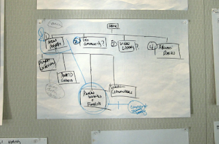
In Sketching User Experiences, Bill Buxton advocates that sketching should become part of the design process early on.

The sketches Buxton discusses are not perfectly crafted masterpieces – that is, they are messy with cross-outs and multicolored lines darting all over the page. Buxton reassures readers that you don’t have to be a designer to sketch. Everyone can get involved through participatory design whereby the “design professional is to work with the users/customers as a combination coach/trainer, to help them come to an appropriate design solution”. The role of the designer in this case is to facilitate communication from participants through visual storytelling.

“In the HCI domain, sketching isn’t optional. Sketching is the foundation for inspiration, transformation, and communication” says Chauncey Wilson, Senior Manager, AEC User Research Team and professor of Bentley University’s HFID Prototyping class. Wilson encourages designers to carry a sketch notebook to carry with you everywhere you go. Whenever an idea comes to mind, don’t write it, but sketch it. Sketching can serve as a brain dump, but also as way to avoid time wasted on those perfectly constructed wireframes and high fidelity prototypes.